3 IDENTITIES
YEAR
2025
delivery year
SCOPE
Full Build
Brand to deployment
CLIENT
Indriya Studios
indriya.studio
IDENTITIES
parent + 3 sub-studios
THE BRIEF
One studio. Three creative worlds.
One coherent brand family.
Indriya Studios came to us with an ambitious brief: build a parent brand and website that could position them for pre-seed investment, while simultaneously launching three distinct sub-studio identities — each with its own visual language, aesthetic, and personality.
Indriya Animation. Indriya Gaming. Indriya Publishing. Three studios united by one vision: bringing Indian stories to the world. The challenge was making each feel completely its own while ensuring they unmistakably belonged together.
WHAT WE DELIVERED
THE CHALLENGE
How do you give three studios distinct identities
without fracturing the parent brand?
Most studios in this position default to one template applied three times with different colours. That creates consistency without character — everything looks related but nothing feels distinct. The brief demanded the opposite: each sub-studio needed to feel like it could exist as a standalone brand, while still reading as part of the Indriya family when seen together.
INDRIYA ANIMATION
Warmth & Craft
Lotus motifs, warm saffron tones, Hindi script accents, and a cultural depth that references traditional Indian artistry. Feels handmade and deeply rooted.
INDRIYA GAMING
Energy & Play
Pixel aesthetic, RPG UI language, dark backgrounds with neon accents. Quest-style copy (‘LEVEL 1 / STATUS: QUEST BEGUN’). Feels like stepping into a game world.
INDRIYA PUBLISHING
Legacy & Literature
Candlelit warmth, archival textures, serif typography, and a reverence for the written word. Feels like a library that has existed for centuries.
The shared spine: all three use the same underlying Next.js architecture, the same typographic system at its core, and the same Indriya wordmark — just expressed through completely different aesthetic vocabularies.
THE PLATFORM
Four pages. Four distinct worlds.
The parent site positions the studio for investment. Each sub-studio page builds its own complete visual identity.
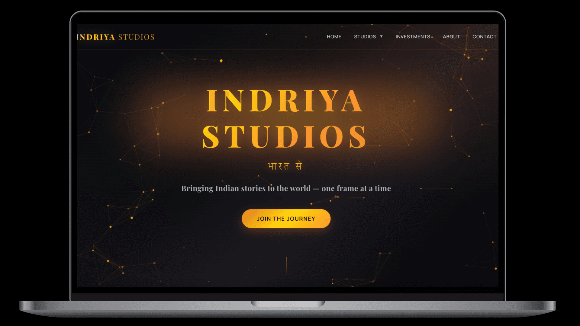
The parent site — investor positioning, three studio entry points, and a pre-seed funding section.
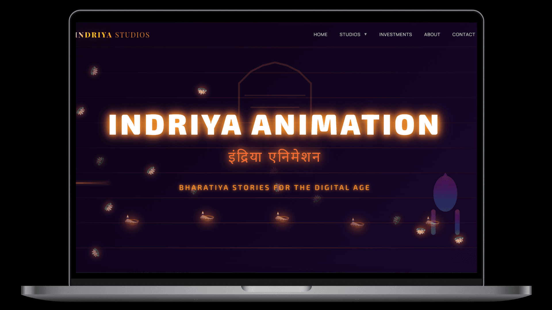
Indriya Animation — lotus motifs, warm saffron tones, cultural depth.
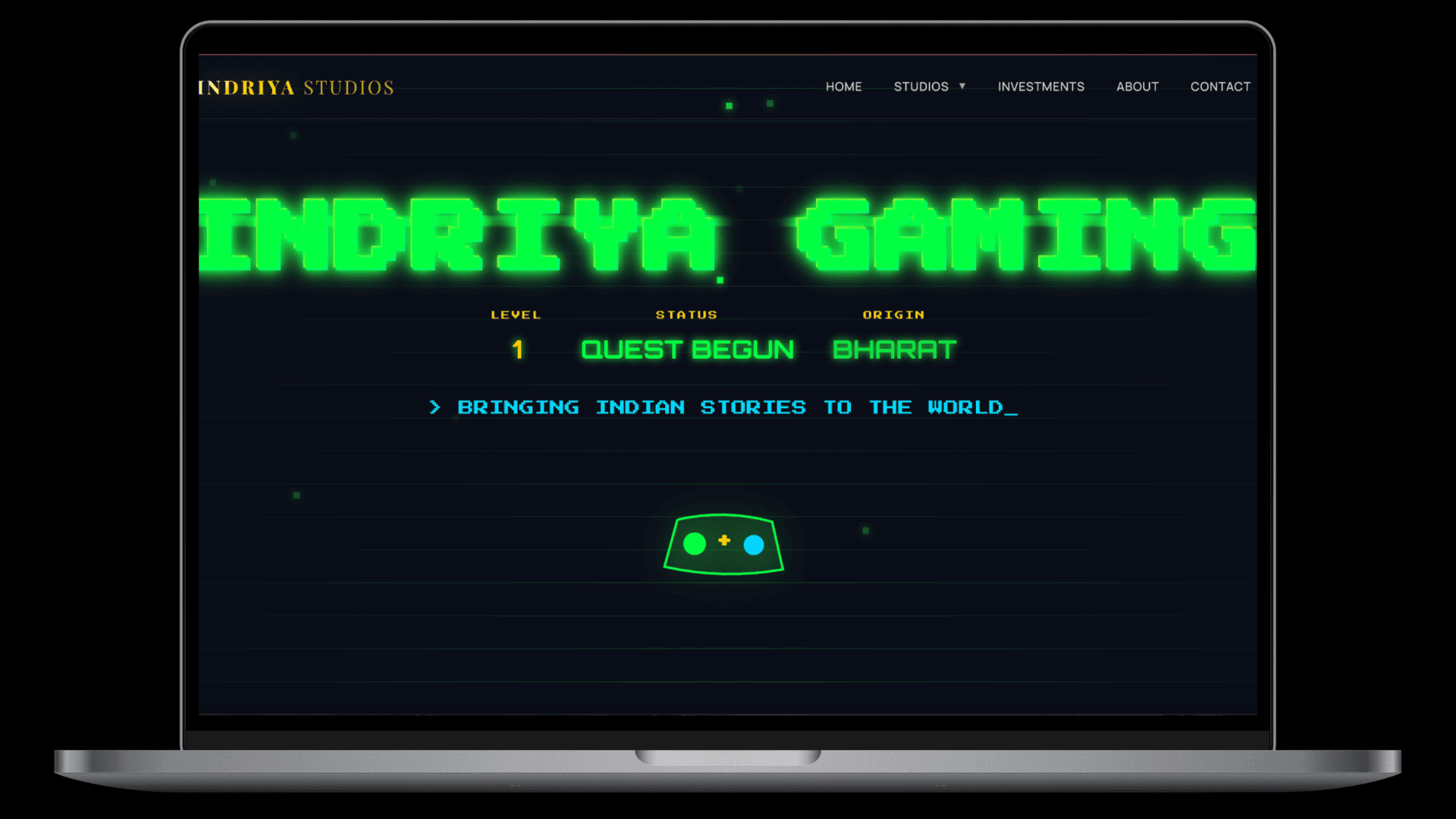
Indriya Gaming — pixel aesthetic, RPG UI language, neon accents.
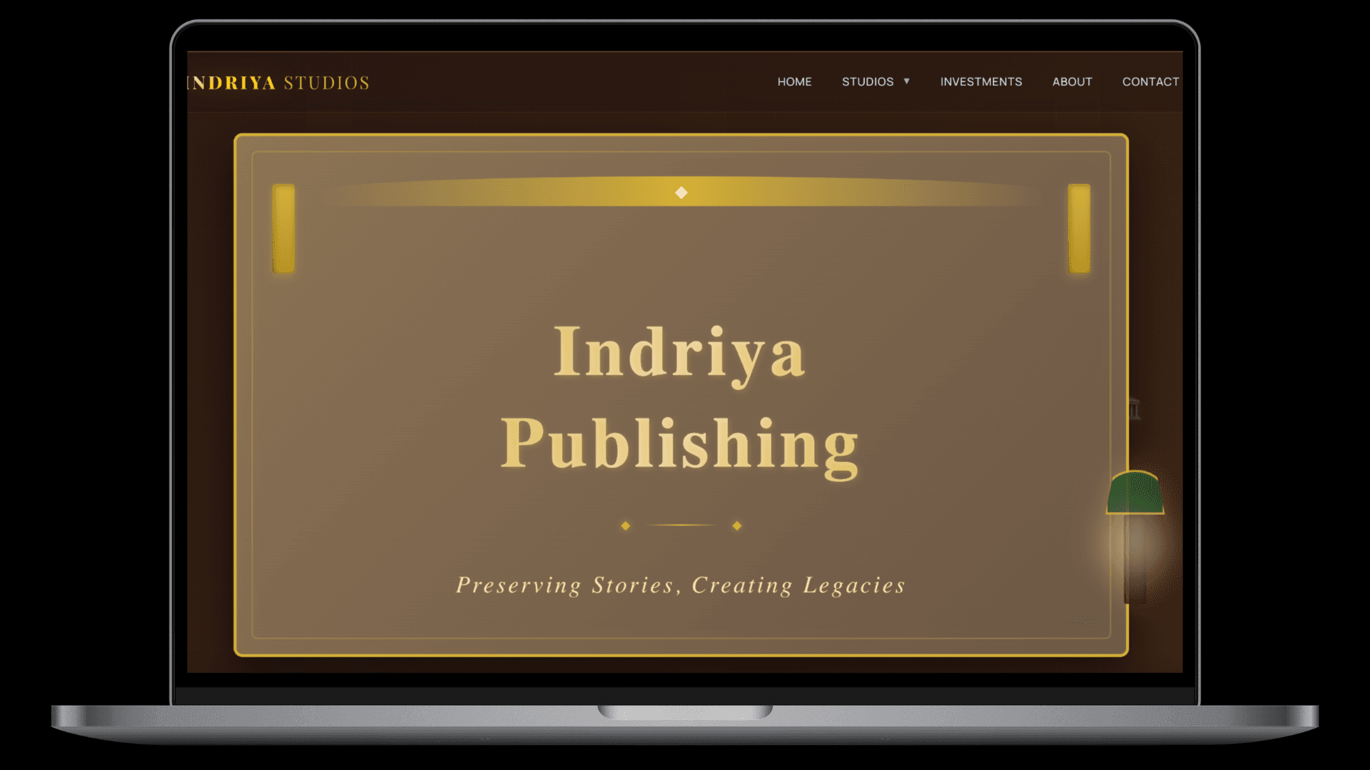
Indriya Publishing — archival feel, literary typography, candlelit warmth.
BEYOND THE DESIGN BRIEF
The website had to raise money.
Indriya Studios is in active fundraising for a ₹45L pre-seed round. The parent website needed to do more than look good — it needed to function as a pitch tool. The investment section had to communicate the vision clearly enough that a potential investor could understand the opportunity without reading a separate deck.
WHAT THE SECTION CONTAINS
Target raise and round size (₹45L pre-seed)
Use of funds breakdown with visual percentages
Vision statement and market opportunity
Clear CTA to request the pitch deck
FUNDING OVERVIEW
₹45,00,000
Pre-Seed Round
WHAT WE BUILT IT WITH
One codebase. Four visual worlds.
The architectural challenge was significant — four pages with completely different visual identities, all living in the same Next.js codebase without any style bleeding between them. CSS custom properties and scoped component theming made it possible.
Next.js 14
Single codebase serving four distinct visual identities through scoped CSS theming and component-level styling.
CSS Custom Properties
Each sub-studio page defines its own design token overrides — colour, texture, and motion — without affecting the others.
Framer Motion
Page-specific animations — lotus float on Animation, pixel glitch on Gaming, slow fade on Publishing. All in one system.
Vercel
Edge deployment with automatic preview deployments on every branch push. Zero downtime on launch.
THE OUTCOME
Four pages that feel like
four different studios.
The site launched with all four identities fully realised — parent brand, animation studio, gaming studio, and publishing studio. Each sub-studio page has a distinct enough aesthetic that it could credibly exist as a standalone brand, while the Indriya wordmark and shared structural DNA make the family relationship immediately clear.
The investment section is live and the pitch deck request flow is functional. The brief was met in full.
“We came in with a vision and no visual language to express it. What we got back was three distinct worlds that somehow still felt like one studio. The gaming page feels nothing like the publishing page — and yet they clearly belong together. That is harder to do than it sounds.”
— Founder, Indriya Studios
HONEST REFLECTION
The three sub-studio pages are strong as launch vehicles — they establish the aesthetic and the vision clearly. With more time, we would have gone deeper on content: actual project pipelines for Animation, game concept pages for Gaming, a proper catalogue structure for Publishing. The design system supports all of this. The brief at this stage was to establish the identity and enable the fundraise. That is what we built.
Building a brand family?
Multi-studio, multi-product, multi-market.
We have done this before.